About the Rebrand
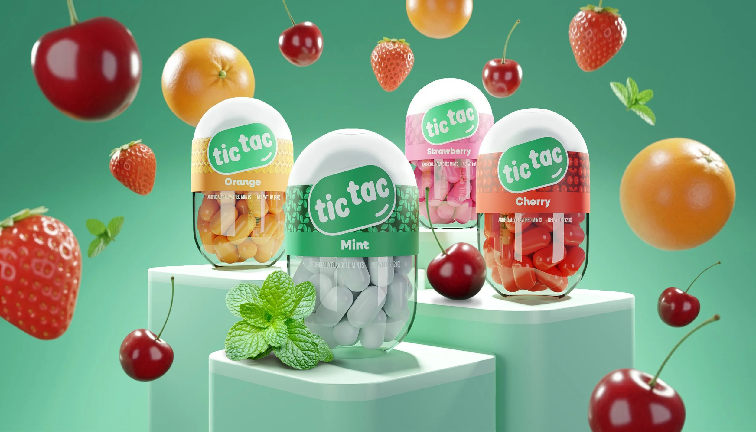
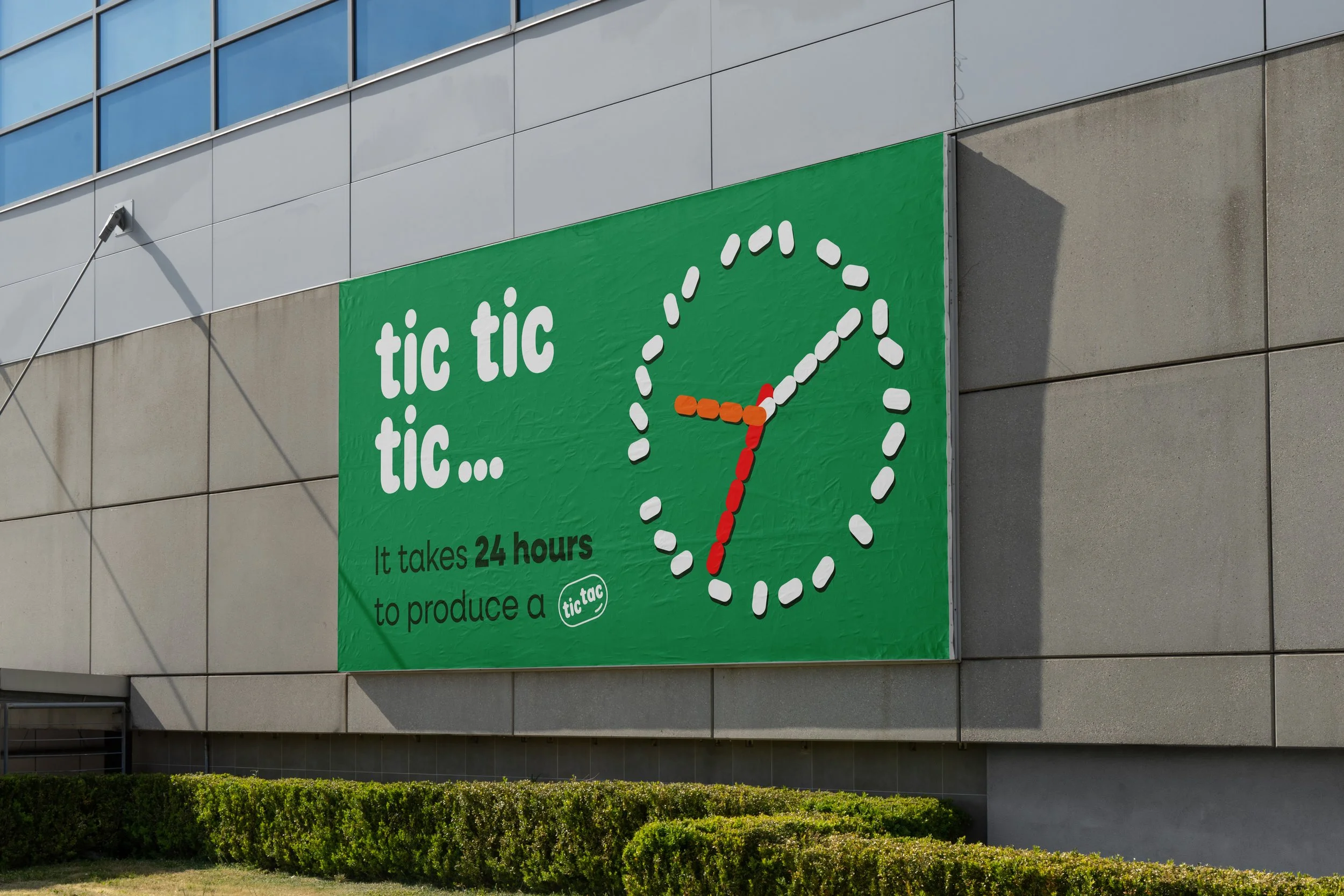
A conceptual rebrand realigns Tic Tac’s visuals with its fruity, fun product experience. I designed a custom logotype, introduced a more compact container, and built a colorful, modern identity system. The rebrand emphasizes the little moment of joy that a Tic Tac brings to every consumer’s day. The result is playful and more reflective of the brand’s current offerings.